Printing Porn – Embellishments and Techniques
To me, there's nothing better than seeing and feeling my final design hot off the press. The choice of stock and embellishments is a huge part of the design process and needs to be considered at the start of the project. These considerations will determine the tone of the project and will create a huge impact on the client/customer/user.
Here's an overview of what you might need to consider:
Coated + Uncoated Stock
What do you want your product to feel like? Choosing your paper stock is vital, and again, should be considered at the very start of the design process. Coated stock has a glossy finish whilst uncoated has a matte finish. Coated stock tends to be most popular for promotional flyers and booklets. Personally, I love uncoated stock; it's different, unusual and feels amazing. I generally always take home brochures if they're uncoated stock!
Stock Weights
The weight of the paper, also known as the 'gsm', refers to the thickness or paper density. If your product needs to be durable, for example business cards, a heavier paper stock should be considered.

Embellishments
There are a number of embellishments you should consider for your product. These tend to be a rare find as you're paying for premium printing. But they DO create a huge point of difference and will impress users even more than your competitors standard brochures.
Spot UV – This is one of the most cost-effective embellishment techniques. A thin layer of gloss is applied to a designated space/graphic while the rest is left untouched, generally used on uncoated stock. This is then set and dried with a UV light. This technique is mostly used on business cards, presentation folders and corporate document covers.
Foils – For luxury items, a foiled stamp might be applied. A custom metal block template is created and the foil is applied after the items are printed. You will most likely see these on wedding invitations.
Emboss/Deboss – Again, mostly used on luxury invitations, embossing raises the surface of the paper by pressing a metal plate of the desired shape directly onto the stock. This will catch your eye in the light and will feeling amazing when running your fingers over it.
Diecut – This technique is used to cut through the paper to create a custom shape. This can be used across any promotional material and it would be useful if you created a die block template that can be used for future products as the initial set up will be the main cost.
I hope this gives you an insight into the world of printing and possibly help you consider how you can get your printed materials standing out from your competition.
Brand quality control and what it really means
Going in line with my next monthly special, I thought I'd talk about brand identity and brand quality control. I see it far too often and feel as if not many people know the true importance of brand quality control or even fully understand it.
So, you have a logo that strongly represents your company and you've invested a lot of time and money into it. However, all your collateral and advertising showpieces that represent your company are inconsistent. Your colours don't match, your logo is fuzzy or has been stretched, you're using a serif font that looks similar to Times New Roman. No offence! Your brand is not speaking with one voice which can lead to doubt, distrust and lack of confidence in the quality of your service or product.
Here's a few steps you can take to make sure your identity stays consistent.
Getting the right logo versions and variations from your creative supplier
I really like to think this happens automatically when receiving a completed logo but unfortunately it doesn't. Upon logo completion you should receive print and digital versions in every possible iteration. Here's a breakdown:
Print version – these files are saved in CMYK (4 colour process made up of Cyan, Magenta, Yellow and Black) or PMS (Pantone Matching System).
Digital version – these files are saved as RGB colours to reproduce correctly when displayed on screen.
One-colour version – generally changed to all black or shades of black and saved in a grayscale format. This is good to use in printed products that aren't in full colour.
Reverse version – this is typically a white version of your logo that can be placed on any dark background. It will come in either a PNG or vector file with a transparent background.
Multiple formats – Within each of the versions listed above, these should come in multiple formats. Overall, there are two formats; line art and pixel based images. Pixel based images (JPG, PNG, TIF) are made up of pixels and WILL become pixelated once stretched over it's originally saved size. Line art files (EPS, AI) are made up of straight and curved lines and can be down-scaled or up-scaled without changing the original displayed quality. Here's an example:
Get a logo style guide or brand guidelines
This too is often included at the end of a competed logo. This is a compiled document outlining the do's and don't around your brand identity. It will include colour breakdowns for print and digital, typography standards, and examples of how the logo should look in application. Brand guidelines are typically used within much larger companies and will outline brand strategy and story, company values, missions and samples of designed work.
Where to go now
If you have an exisiting logo and would like to align your branding, get in contact with a creative personnel or make sure you ask for these requirement upon completion of your logo design.

Investing in a Capability Statement
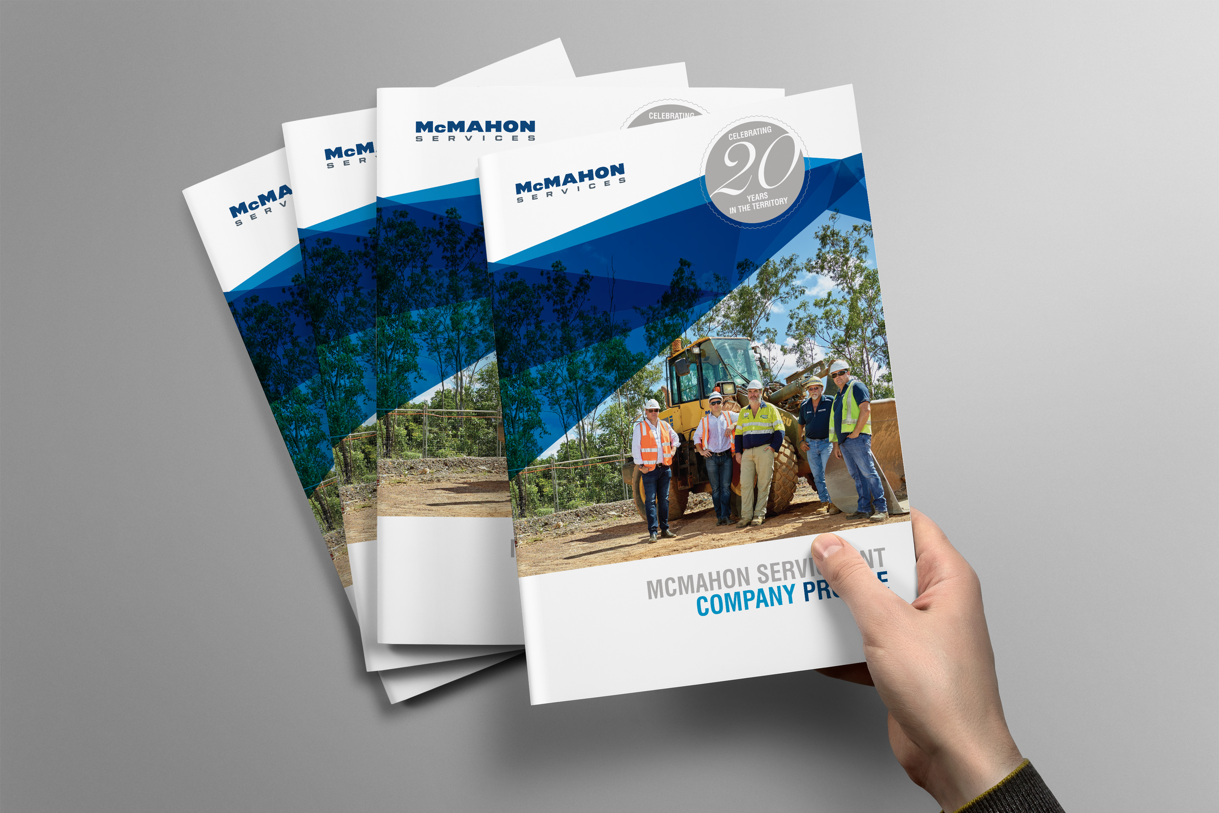
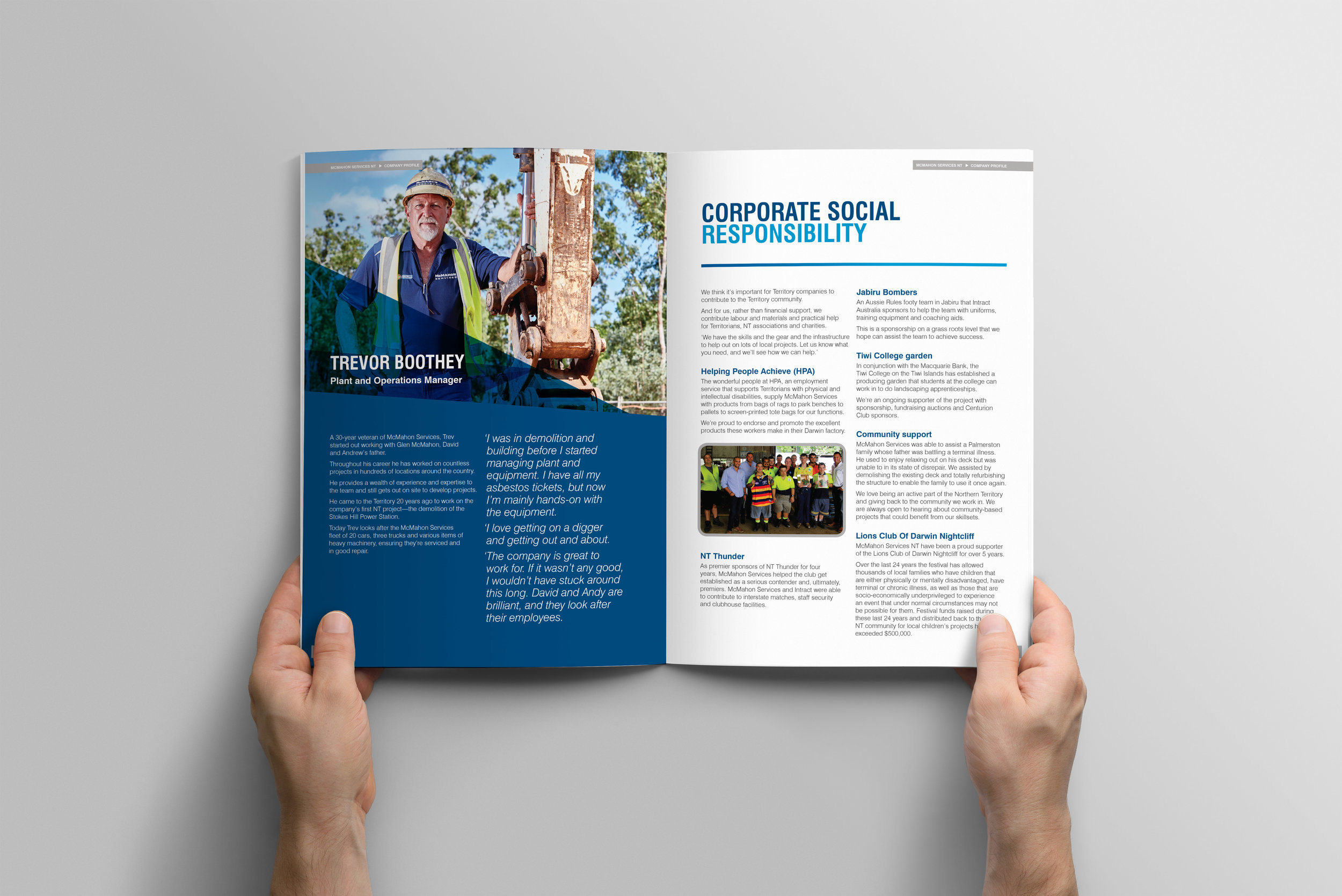

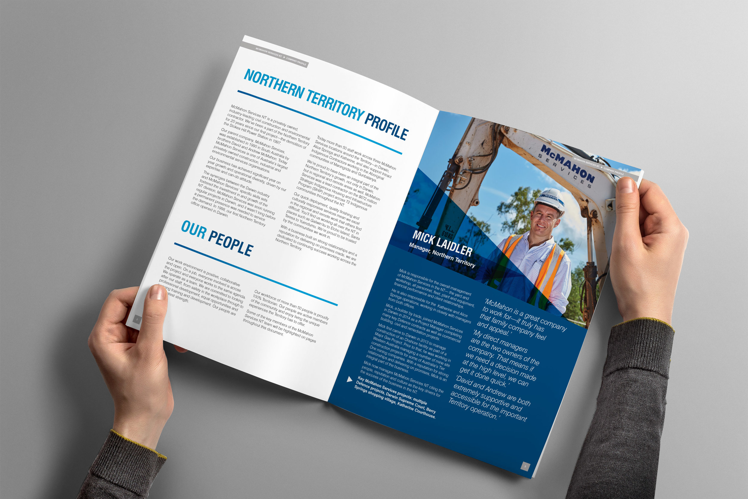

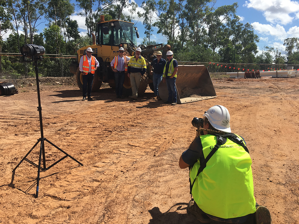


McMahon Services NT Capability Statement, 24 pages, designed and coordinated by Jess Cussen Graphic Design, written by Communicate NT, photographed by Shane Eecen at Creative Light Studios and Jodi Bilske at Jodi Bilske Photographics in Katherine, printed by ZipPrint.
You hear me talk about capability statements all the time – I promise it's not the only service I offer! I'll be honest though, I love them and I really enjoy working on them.
Having a company capability statement is becoming increasing popular, and almost mandatory, when seeking new or potential business. This document will formally tell readers who you are and what you're capable of doing for them.
CONTENT
When written powerfully and persuasively, a capability statement can differentiate your business from its competitors and and reinforce its importance to the prospect. A rough structure of content might look like this:
Company Overview / About Us
Key Services / Product points that appeal to your target audience
Past Project and/or Current Clients
Contributions / Community Input
Accreditations / Certifications / Awards
Call to Action / Contact Details
LAYOUT + PRESENTATION
Design. My expertise. I may be biased but presentation is everything. You can have wonderfully written sentences forming tidy paragraphs, but if it's presented in a Word document with overly huge margins and weird lines break, it's not going to be very appealing to read. Having your capability statement professional designed will reinforce your brand and improve readability to engage your readers. More points for a desirable presentation are:
Photography – you've heard it before, a picture is worth a thousand words. Invest in a professional photoshoot of your company, not only allowing them to be used in your capability statement, but also in future material.
Print – it's not dead!! Especially when done right, this can create a HUGE professional and quality impact creating memorabilia and again, differentiating you from your competitors.
Infographics – business structures or general data visualisation saves the reader time creating a more enjoyable experience.
So... what are you waiting for?