THE LOGO DESIGN PROCESS: for Darwin NT Company Hatch Solutions
Have you ever wondered what work goes behind creating a logo?
During my recently completed logo design for Hatch Solutions, I made sure I saved my ‘work in process’ so I could share with you the three main processes I take in order to create a logo.
Company overview: Hatch Solutions is bespoke and not afraid to challenge the status quo. Their work portrays high quality, professionalism, and innovation. With both owners having diverse skillsets in the private and public sector, their service sure is one you can trust.
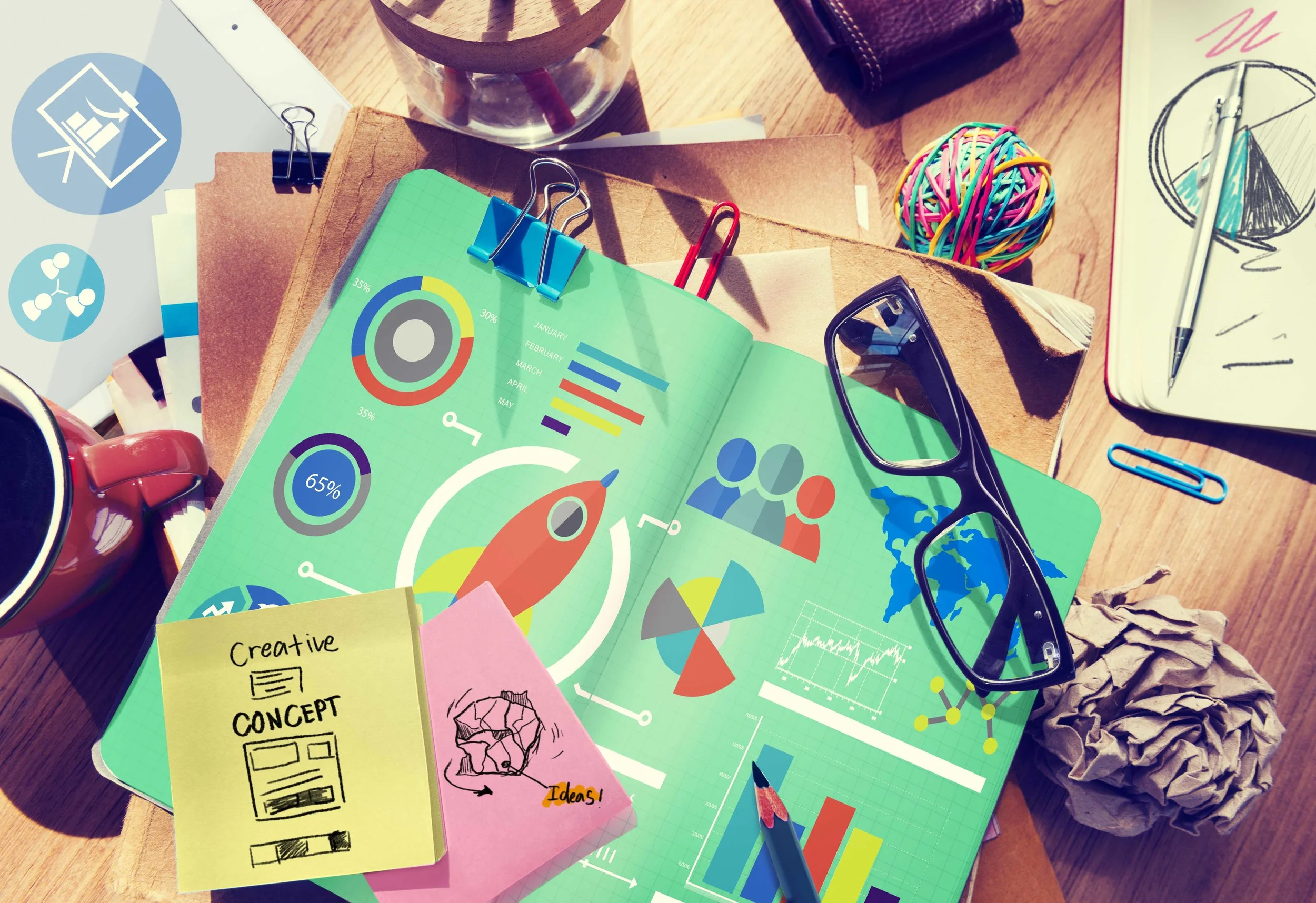
MARKET RESEARCH + MOOD BOARD

Market Research is a visual evaluation on the companies competitors, both local and interstate. The main questions I ask myself are:
What common elements are these companies using in their logo/branding design?
How is that making me feel in terms of the service they offer? i.e is it a true reflection?
What works about their design, and what doesn’t work?
and finally…
What can I do to make mine different and better?
Once I have these thoughts floating around in my head, I then move onto the mood board. A mood board is a series of images, patterns and colours that intend to project a particular ‘style’ of concept. Once I have pulled off a few images for inspiration, I then move onto some sketches.
SKETCH + SCAN

At this stage, I may have 100 ideas floating around in my head. The quickest way to get them out is to sketch. Sketching is an important aspect of creating a logo design. It allows me to have complete freedom to explore my imagination and come up with some (very rough) creative ideas.
Once I have chosen a concept idea, I then scan my sketch and save it to my computer. This allows me to then place the image into my design program so I can trace and digitalise.
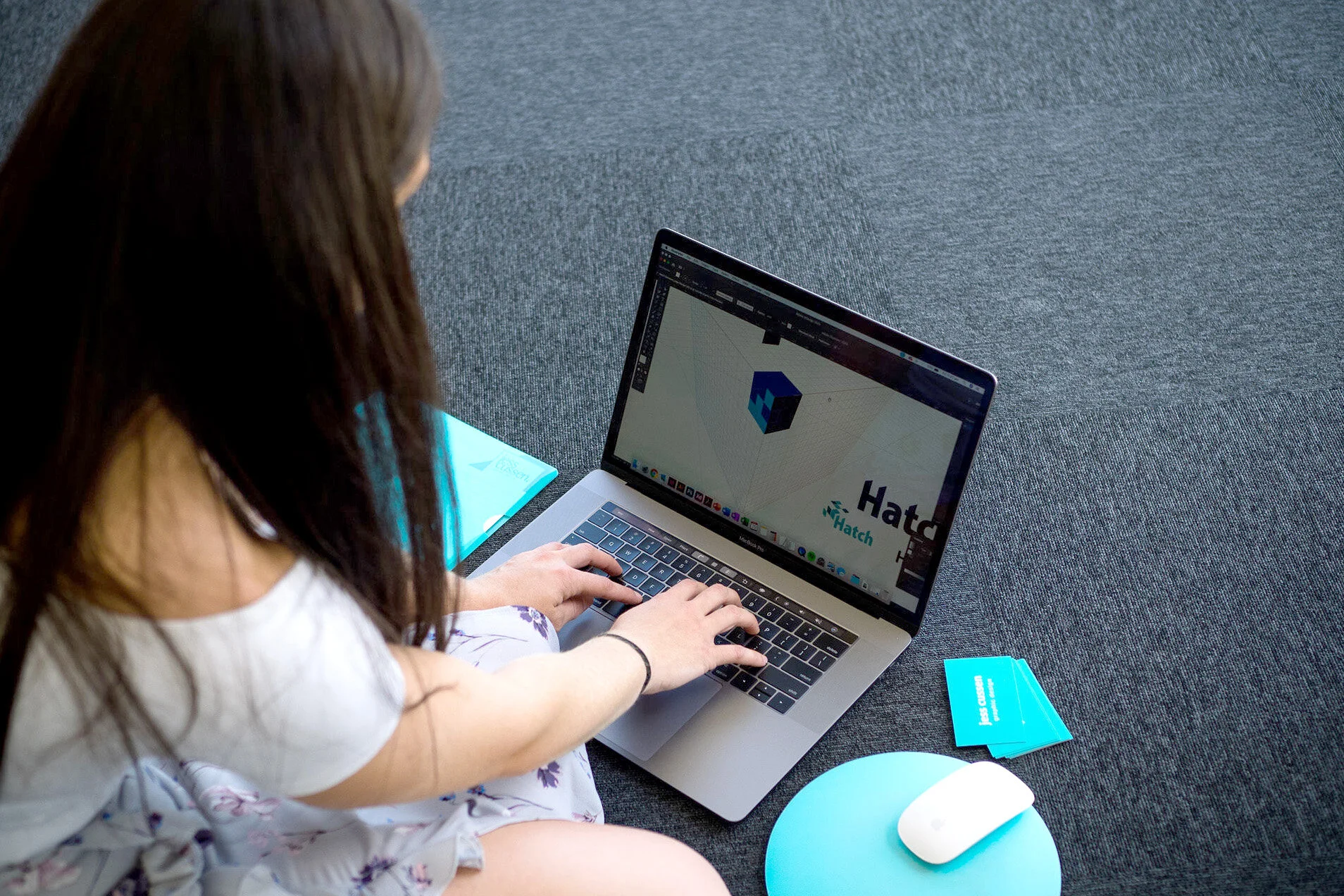
CREATE

Now for the fun part! Creating the logo in a digital format. This part in itself has multiple processes, which takes a lot of experimenting and trial and error. For this particular project, I started with the icon creation. This was fairly easy as I already had done my sketches and I knew what I wanted.
Please note: sometimes a sketch idea doesn’t work in digital format so there might be some times where I need to go back to the drawing board.
Once I had a rough outline of my icon, I then experimented with different font choices and colour combinations. Fonts and colours are tweaked to ensure the design is 100% unique.
This process doesn’t happen quickly. Sometimes I need to look at the logo 8-12 times before I am completely happy with it.
THE FINAL LOGO DESIGN
After experimenting multiple times with fonts, colours and format lockups, a final design was decided on to present to the client.
And there we have it.
I hope you enjoyed this blog and gained some insight into what it takes to create a logo!
“Jess was absolutely fantastic to work with in developing the branding for our new business. She listened to what we were after and developed a brand that is ‘on point’ and represents what we stand for. Jess was responsive, professional and super helpful. I would have no hesitation in recommending Jess for any of your creative design needs.”
INFOGRAPHICS: LETTING PICTURES TELL YOUR STORY
Infographics are a bit of a buzzword in design circles these days, but put simply, it’s the use of an image to relay information to a reader.
Infographics are everywhere. That little green person at the traffic lights that tells you when to cross is an infographic. The no smoking sign on a restaurant window, is an infographic. Even the signs on bathroom doors are infographics. They are everywhere and they are super effective at telling a story.
Why our brains like infographics
Our brains are amazing machines that process information at lightning speed but our brains also like to be lazy. With our super short attention spans (thanks a lot smartphones!), our brains are looking for the easiest way to get as much information as possible. That’s why we like TV and movies, especially after a busy day at work.
In fact, the brain processes visual content 60,000 times faster than it does a block of text. It can understand meaning and emotion and other important information in a fraction of a second. That information helps us decide if we’re interested and if we’ll go to the trouble of finding out more.
The infographic test
Let’s try a little test. Which of these two examples is the most appealing to you as the reader?
Example a) text only
As at 30 June 2018, Foster and Kinship Carers had 828 active members on our database. 68% of those members are female and 32% male, with 10% of our members identifying as Aboriginal.
Example b) infographic

It’s the image isn’t it!? Now if you close your eyes, can you still see the infographic in your mind’s eye?
The facts about infographics
The fact is that infographics are hugely effective at getting a message across. In fact:
Visual information improves learning and retention by 400%.
Infographics are liked and shared 3x more on social media than any other kind of content
People following directions with illustrations did 323% better than those without illustrations
Infographics are 30 times more likely to be read than text
Incorporating colour increases the reader’s attention span by 82%
You can represent almost anything with an infographic and how it is presented, is limited only by your imagination and the imagination of your graphic designer.
Talk to your designer early on about the most important information in your document. They’ll have some great ideas on how to represent that information in a way that is going to be appealing and memorable. Your customers’ brains will thank you for it!
The infographic text and image sourced from Foster and Kinship Carers Association NT Annual Report 2017-18
REBRAND OR REFRESH? WHAT’S THE DIFFERENCE?

If you know anything about business at all, you’ll know that the look and feel of a business is one of the most important things you will work on. Your brand is how people recognise, understand and remember you.
Think of big names like Coca Cola, McDonalds, Apple and Microsoft, Facebook, and Visa. They are instantly recognisable by their branding alone. But even these mega companies constantly tweak their logos to keep them modern, fresh and appealing to their target audiences.
Just look at how the Google logo has changed over the years. Some of the changes are minor but they make a huge difference.
So what happens when your current business look is a bit stale? You’ve got two options: rebrand or refresh.
REBRAND
In the past, most businesses would go for the rebrand. This involves a complete overhaul of your brand identity, creating a whole new look and personality for your business. It is often associated with a change in the industry, your target market or even new owners who want to stamp their own identity onto the business.
As you can see from the example below, Good Sparks Electrical went for the rebrand. They changed their colour palette, their font choices, and they changed how their business name was represented visually.
They now have a modern, slick and simplified logo that has broad appeal but still says exactly who they are and what they do.

The downside of a rebrand is that now you have to change every single piece of stationery, marketing material and other branding. This can be pretty time consuming and expensive but is necessary to maintain your professional image.
But maybe there’s a better option?
REFRESH
If you don’t feel that you need a complete rebrand, your best option is a refresh. This is an increasingly popular option for businesses that don’t need a total identity overhaul and are pretty happy with their current image.
The example of Terracorp Industries shown below demonstrates how a minor tweak to the image and font of the logo, can modernise the whole thing. You’ll notice a small but noticeable change to the colour palette that makes the logo more vibrant and impressive.
With a refresh, you can get away with using your old logo on your existing branded material for a little bit longer and do a gradual update over a period of a few months. You probably won’t want to take that long though, considering how beautiful your new logo looks!

Stay ahead of your competitors and make sure you keep appealing to your target audience. A simple change in font can make all the difference.
If you’re not sure what option is best for you and your business, get in touch and we’ll help talk you through it. We can provide you with a range of options and some great ideas to make sure your business continues to look modern and vibrant.